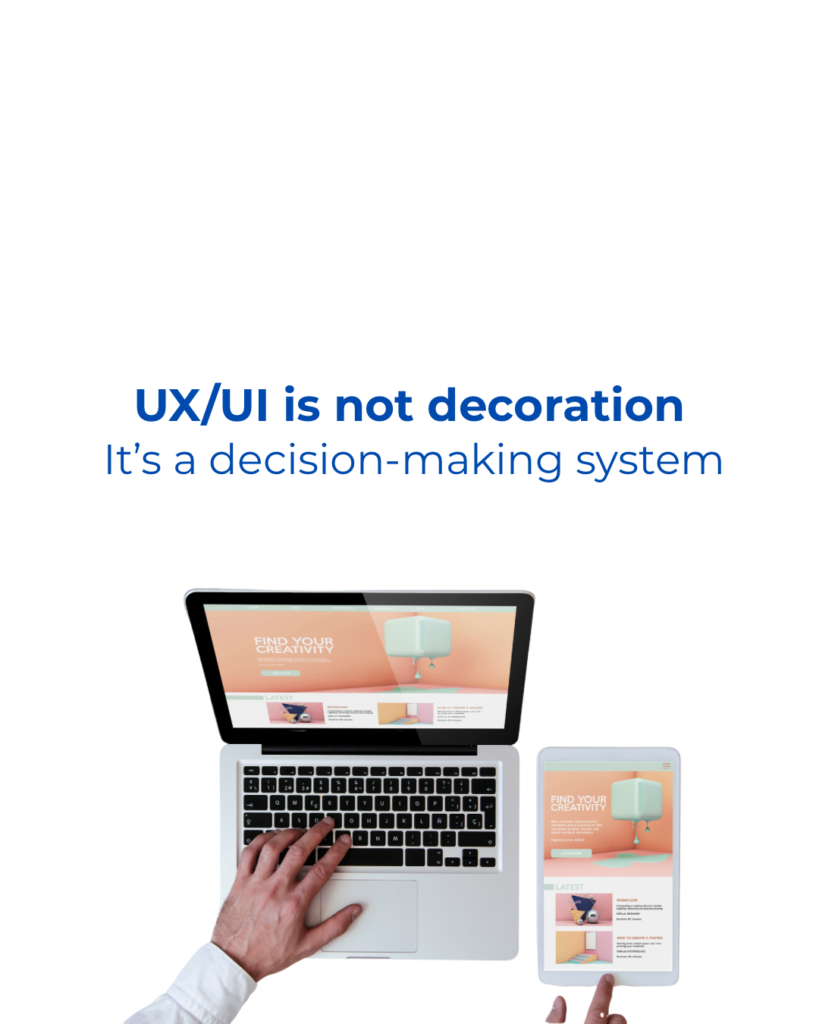
When people think about websites, they often picture colors, fonts, or beautiful images. But here’s the truth: a website’s success depends on its structure — not its visuals.
The way your pages are organized, how information flows, and how users move from point A to point B determine whether people stay, understand your offer, and eventually contact you. Website structure is crucial for a well-organized website.
Understanding the website structure for conversions can significantly enhance user experience and increase your conversion rates. A strong website structure for conversions ensures that visitors can easily find what they are looking for, leading to more engagement and ultimately higher conversion rates.
A pretty design will attract attention…
But a strong structure drives conversions.
In this article, we’ll break down what website structure & logic really mean — and how you can use them to increase sales, trust, and user satisfaction.
What Is Website Structure & Logic?
Website structure is the architecture of your site — how pages are organized and how users navigate between them.
Website logic is the intelligent flow of information — what users see first, where they click next, and how the site guides them toward taking action.
Together, they create a website that feels natural and effortless.
A strong website structure includes:
Why Website Structure Matters More Than You Think
Most users spend less than 5 seconds deciding if your website feels trustworthy.
Good structure communicates professionalism instantly.
Here’s what strategic website logic improves:

Implementing a well-thought-out website structure for conversions is crucial. It not only improves user experience but also fosters trust and encourages visitors to take action.
✔ User Experience (UX)
People should know where to click without thinking.
✔ Conversions
A logical flow leads visitors to book, call, or buy.
✔ SEO
Google rewards structured sites with clear hierarchies.
✔ Bounce Rate
Confusion = exits. Clarity = engagement.
✔ Mobile Usability
Mobile-first structure is essential – more than 60% of local users browse websites on phones.

The 5 Elements of a Strong Website Structure
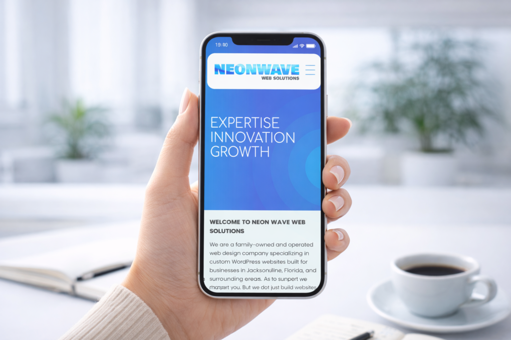
1) A Clean, Predictable Navigation Menu
When considering website structure for conversions, ensure that your content is organized in a way that guides users naturally through their journey. This means creating a logical flow that keeps users engaged and moving toward your desired actions.
Your menu should show your most important pages – not everything your business has ever done.
Best structure for service businesses:
- Home
- About
- Services (with sub-services)
- Pricing / Packages
- Portfolio / Examples
- Contact
- Testimonials
More info about the Website structure here.
2) A Homepage That Leads the User Step-by-Step
Your homepage should not say everything.
It should guide the visitor through a clear journey:
- Who you are
- What you offer
- Why it matters
- How you’re different
- Social proof
- Clear CTA (Book / Call / Quote)
Each section should answer the next question the user naturally has.
3) Logical Service Pages
Each service page must follow a clear structure:
- Problem
- Solution
- What’s included
- Benefits
- Process
- Pricing (if possible)
- CTA
This structure is proven to increase conversions.
4) Smart Internal Linking
To optimize your website structure for conversions, it’s essential to evaluate the clarity and simplicity of your navigation. Every element should serve a purpose in leading visitors to explore your offerings deeper.
Linking pages together helps:
✔ Users find what they need
✔ Google understand your site
✔ Increase time on site
Understanding Website Structure for Conversions
Examples:
- “Learn more about our process →”
- “See examples in our portfolio →”
- “Explore related services →”
5) A Clear CTA Path
Every page should lead to the next step.
CTA examples:
📩 “Request a quote”
📞 “Call now”
📝 “Book a consultation”
💬 “Send a message”
There should always be a next step.

Common Website Structure Mistakes (And How to Fix Them)
Here are the issues we see most often in websites we redesign:
❌ Too many menu items
❌ Services buried inside confusing dropdowns
❌ No clear user flow
❌ Homepage overloaded with text or random sections
❌ CTAs missing or unclear
❌ No internal linking
❌ No logical order of content
❌ Sections placed “because they look nice,” not because they make sense
Fixing these instantly improves conversions.
Strategically placing calls to action throughout your website structure for conversions can make a significant impact. Ensure they are visible and compelling to encourage user interaction.
Finally, always monitor your analytics to see how changes to your website structure for conversions affect user behavior. Continuous improvement is key to sustaining high conversion rates.
Our contact information can be found here